Usability Test of Reformed Compare Chart - Phase II

Overview
This study evaluated the redesigned compare chart on video doorbell product detail pages through moderated usability testing with experienced and novice home security device users on both mobile and desktop platforms. The goal was to assess discoverability, placement, and overall user experience with the new design.
Key findings identified usability issues and informed recommendations for mobile and web accessibility, content improvements, and interaction enhancements.
My Role & Project Details
Timeline: 3 weeks
Tools:
• UserTesting.com
• Confluence
• Jira
• Quip/Word Doc + Excel sheet
My Role: As a Solo UXR on the team, my responsibilities were
• Gather project details with direct and direct goals
• Propose and execute usability test covering all the hypothesis
• Analyze the data and present actionable next steps to the team
Product Space & Context
A leading provider in home security solutions offers a variety of products including video doorbells, outdoor cameras,indoor cameras, and alarm systems. Their distribution network includes their own platform, major online retailers, and other stores, making them a well-recognized brand. Consumers considering a home security system often compare this company's offerings with competitors to find the best value.
User Problem
Previous research has shown that prospective buyers visit to gain a better understanding of the products, but they are facing difficulties with discovering and using the compare charts (CC) on the site.
We noticed two major issues in the previous research:
• Discoverability: On both Product Marketing Page and Product Detail Page, 70%-80% of users do not scroll down to where the compare chart is located. Out of the 10 participants in the user study, 8 were unsuccessful in finding the comparison chart on ring.com.
•Usability: 8 out of 10 participants expressed frustration over the compare chart navigation on mobile. Most participants reported confusion regarding the content on the charts. The main pain points were feeling overwhelmed by the amount of information and not understanding certain terminologies. 4 out of 10 participants expressed a desire to be able to select specific products for comparison.
Business Problem
Customer Decision Fatigue caused by an overwhelming product selection is negatively impacting conversion rates. This results in decreased customer satisfaction, increased bounce rates, and a loss of potential revenue.
Goal of the Study
In this design validation phase, the research goal was to understand:
• How do users perceive the new compare chart design in product detail page
‣ Placement of the CC in the page
‣ Comparable criteria present in the compare chart
‣ The hierarchy of the criteria present in the CC of Video Doorbell
• How efficient is the new CC in helping users understand different comparable products?
• Uncover any issues users face while comparing the products in their buying journey on product detail page.
Method
Usability Testing; each session lasted for 50-60 min.
Sampling
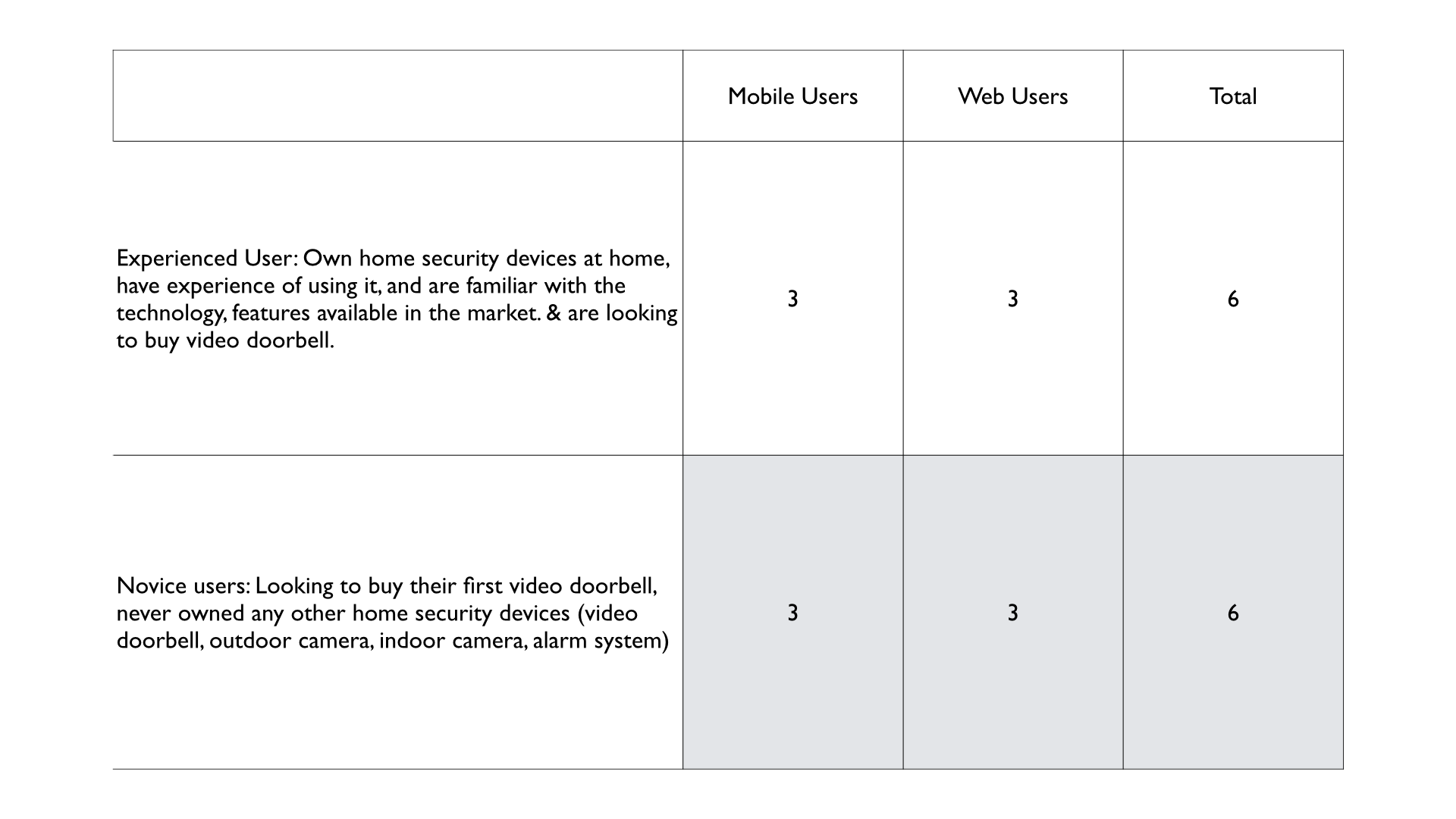
12 Participants were categorized equally in two groups, i.e. 'Experienced users' & 'Novice users' to account for potential differences in shopping behavior arising from varying levels of product experience and home security industry knowledge. This segmentation enabled me to identify distinct patterns and preferences between the two user cohorts.
Project Scope: To pinpoint customer pain points and measure satisfaction with the new design, this usability study focused on just one product, i.e the video doorbell.
Research Findings
• Users positively received the new comparison chart placement on the product detail page. While not actively sought, its discovery was generally welcomed
• Users highly appreciated the design layout of the comparison chart, and the easy to consume succinct content.
• Users appreciated the customizable comparison chart, which streamlined product identification and selection.
• Users loved the compare chart customization but struggled to find the edit option in both desktop and phone platforms, contributing to the perception of a static compare chart.
• ‘Select up to two devices’ copy in the comparison chart pop up, caused confusion regarding the device count. Users mistakenly included pre-selected devices in the device count, and got frustrated with confusion of how many devices they can add to the comparison chart.
• Users requested additional comparison criteria including dimensions, colors, storage, recording capabilities, and installation details. A consistent, concise format with optional visual aids is preferred to enhance product understanding and prevent information overload
• Users positively evaluated the comparison chart's criteria and their arrangement. While informative, users identified gaps in specific product details such as field of view, night vision capabilities, battery life, and installation requirements. Comprehensive product information is essential for building user confidence in purchase decisions
• Comparison charts facilitated informed user choices by incorporating verified ratings from reputable sources. Users sought deeper insights through clickable ratings.
• Accessibility issues were identified in the comparison chart design. Color contrast and element sizing hindered visibility, and the table format was initially unclear.
• Users struggled to find tooltip icons, often searching for definitions elsewhere, highlighting the need for improved icon visibility.
• Lack of product differentiation between advanced models caused user confusion and undermined perceived product value. Users were inclined to downgrade product selections when advanced models offered limited feature differentiation.
Analysis
Through affinity maps, and task analysis, I grouped common insights and highlighted the main themes answering each research question
Due to confidentiality restrictions, specific project details cannot be shared. However, I am presenting my process and general observations from my research work.
Recommendations
High Priority:
1. For discoverability, provide more visual weight to 'Select devices to compare' text link on the compare chart (both mobile and web medium) for users to notice that they can configure the compare chart.
2. Make the design elements like lines, borders, separating rows’ colors, icons, logos, text easily distinguishable and perceivable, complying to EAA guidelines.
3. To enhance the compare chart's effectiveness and usability, include concise details on battery life for battery-powered video doorbells, charging time, complimentary battery availability, wiring/installation details for wired doorbells, field of view, and night vision capabilities (color/black-white).
4. Users expressed confusion regarding certain criteria due to the absence of clear tooltips. Implementing prominent tooltip icons or providing hover-over definitions for each criterion will be more accessible and enhance user understanding.
5. Add new criteria like Ease of Installation, Installation details, Product Dimensions + Available Colors in the comparison chart.
6. Incorporate relevant links to streamline user actions, such as subscription pages, product details, and review pages directly within the comparison chart
7. To streamline the user experience, incorporate 'Buy Now' and 'View Details' buttons at the end of the compare chart for each product, eliminating the need for users to scroll back up the chart to perform these actions.
8. Revise the 'Select up to 2 devices' copy to provide clear guidance on whether pre-selected devices are included in the count or if users must manually select two other devices from the preselection to avoid confusion.
9. Add a loading/updating micro-interaction when users hit the 'update' button after updating the devices in the comparison chart. Users often get confused if the changes have been updated in the comparison chart or not.
Mid Priority:
1. Put the criteria in an order of ascending/descending order of similarities to differences between the compared products. This approach will streamline information processing for users and quickly highlight the additional value propositions of higher-priced products or subscriptions.
2. To clarify feature differences, include a "visual context" link within tooltips. This will visually demonstrate advanced capabilities (e.g., bird’s eye view, audio+), aiding users in understanding the value of premium options.
3. A prominent comparison chart anchor link at the top of the product detail page will enhance user navigation. Research indicates that comparison charts aid in product evaluation and discovery. Early access to this tool will help users explore options more effectively.
4.Users found the comparison chart and need-product assessment quiz valuable tools for product selection. They expressed a desire to see quiz recommendations integrated into the comparison chart for easier product evaluation. The combined use of these tools effectively streamlined product discovery and purchase decisions.
Low Priority:
1. Add flexibility for users to restructure/adjust/shuffle placement of the compared devices in the compare chart.
2. Provide clickable review links where users can run down the customer's reviews.
Next Steps
The usability testing findings provided valuable insights for the team. All recommendations were promptly implemented,resulting in significant improvements to the comparison chart design.
Reflection & Learnings
Confirmation of Design Decisions: While usability testing can uncover problems, it can also validate design choices.Observing users successfully complete tasks and providing positive feedback reinforces the effectiveness of certain design elements. This can boost confidence in the overall design direction.
Check other
Projects


#Qualitative Study #User Interviews #Contextual Inquiry #Discovery Research #Usability Study

#Cubigo Web App #Usability Test #Accessibility Audit #Semi-Moderated User Interviews #Mixed Method Research