The Role of Comparison Chart in Customers' Buying Journey - Phase I

Overview
The compare chart is a key tool in users' buying process, but its current design hinders user experience.
This study explored when and how customers use comparison tools in their buying journey e-commerce website, identifying pain points and expectations.
I conducted moderated user sessions with experienced and novice home security device users to understand their buying journey and needs.
My findings revealed critical issues with the current compare chart, informing product, design and content strategy. These recommendations were well-received, and implemented to guide the next phase of the product roadmap.
My Role & Project Details
Timeline: 4 weeks
Tools:
• UserTesting.com
• Confluence
• Jira
• Quip/Word Doc + Excel sheet
My Role: As a Solo UXR on the team, my responsibilities were
• Gather project details with direct and direct goals
• Propose and execute efficient and effective research plan encompassing research questions
• Analyze the data and present actionable next steps to the team
Product Space & Context
A leading provider in home security solutions offers a variety of products including video doorbells, outdoor cameras,indoor cameras, and alarm systems. Their distribution network includes their own platform, major online retailers, and other stores, making them a well-recognized brand. Consumers considering a home security system often compare this company's offerings with competitors to find the best value.
User Problem
Comparison is an integral part of customers' buying process. Customers face a complex and overwhelming decision-making process when selecting from a diverse product range on the website.
The current compare chart falls short of providing essential information and is difficult to locate, hindering user experience and potentially impacting purchase decisions.
Business Problem
Customer Decision Fatigue caused by an overwhelming product selection is negatively impacting conversion rates. This results in decreased customer satisfaction, increased bounce rates, and a loss of potential revenue.
Goal of the Study
This project aimed to enhance the customer buying experience by providing clear and relevant product details, boosting purchase confidence. To achieve this, the study focused on:
• Developing a content strategy for the product comparison chart.
(This strategy would define the information displayed and how it's presented.)
• Recommending optimal placement for the chart within the Ring.com customer journey.
(This ensures customers encounter the chart at the most impactful moment.)
Method
Semi-structured user interviews + Tasks to perform on ring.com; lasted for 50-60 min.
This method assisted me with rich qualitative data highlighting underlying motivations, attitudes, behavioral patterns, struggles, and opportunities which are essential for understanding and enhancing the customer experience on ring.com
Sampling
12 Participants were categorized equally in two groups, i.e. 'Experienced users' & 'Novice users' to account for potential differences in shopping behavior arising from varying levels of product experience and home security industry knowledge. This segmentation enabled me to identify distinct patterns and preferences between the two user cohorts.
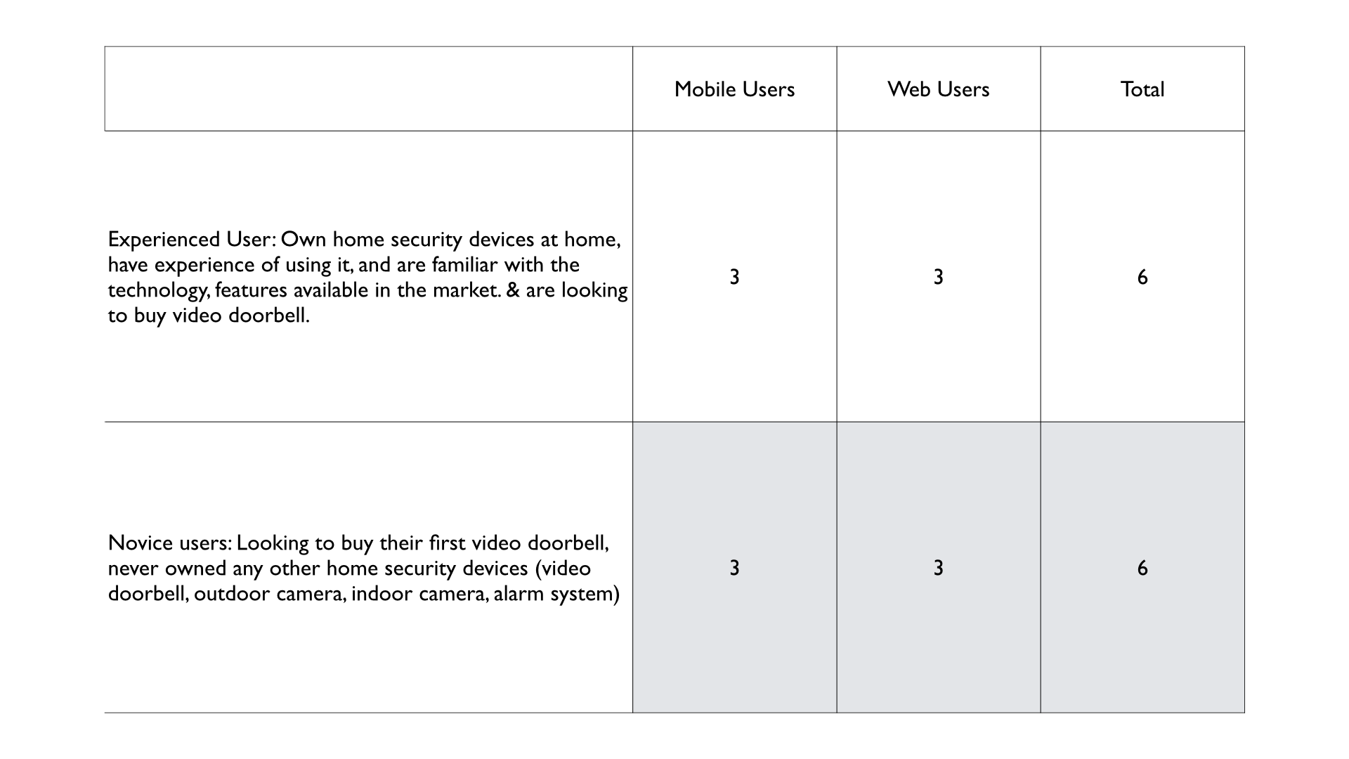
Project Scope: To gain a deep understanding of customer preferences and challenges, this study concentrated on Ring's most popular product: the video doorbell. This focused approach allowed for a comprehensive exploration of the customer journey within a specific product category.
Research Findings
• Users often prefer to visit the company's webpage for a more comprehensive understanding of the product and subscription options.
• Both experienced and novice users had a clear understanding of their needs and expectations regarding video doorbells. Their buying journey was similar, with minor differences in their comprehension of technical jargon, features, brand awareness, and trust.
• Customers use the comparison chart to expedite their decision-making process, eliminate undesired products, and stay informed of any new criteria or relevant products efficiently.
• The selection and comparison process starts on the product listing page, where customers use categories (battery/wired), images, price, and 'best sellers' tags to choose a product.
• With over 100 products listed, customers experience paradox of choice and feel paralyzed by the choices, leading to overwhelming and delayed decisions.
• Context in comparison charts is crucial. Users expect product image, price, specifications, and reviews. Technical specifications should clearly explain in short and visually represent jargon like bird eye view etc., helping users reassess their needs and consider advanced features.
• Users preferred the ability to add and remove products on the comparison chart according to their needs. This feature allowed them to quickly browse through the product range, compare similar items, and narrow down their options right away.
• Users with security concerns and a safety mindset sought out the 'best in class' product. Tags like PRO, PLUS, and GEN 2 were important as they indicated the superior product with more features. Conversely, another group of users focused on their specific needs and matched them with the features of each product to determine the best fit. The product tiering did not influence their buying decision.
Analysis
Through affinity maps, and task analysis, I grouped common insights and highlighted the main themes answering each research question
Due to confidentiality restrictions, specific project details cannot be shared. However, I am presenting my process and general observations from my research work.
Recommendations
Product Strategy Recommendations
• A streamlined onboarding process, coupled with product assessment quizzes and comparison tools, can enhance user experience and decision making.
Design Recommendations
• Optimizing the Comparison Chart Placement: The comparison chart should be predominantly on both product listing and detail pages. Optimal placement within the first two scrolls of the product detail page, coupled with a clear call to action in the first scroll of the page, maximizes user engagement and decision making efficiency.
• Leveraging established user expectations, the comparison chart's design should align with familiar e-commerce platforms to optimize usability (Jakob's Law). Benchmarking against industry leaders will inform design decisions.
Few of the most used e-comm site’s comparison chart example that builds users mental model are as follows:

• The current horizontal scrolling format on a mobile platform hindered product comparison, leading to user frustration. A side by side customizable layout is recommended for improved usability.
• A dynamic comparison chart enhances product discovery by allowing users to easily add, remove and compare devices in one location. This would reduce cognitive load and steps to visit multiple pages to find products and compare manually.
Content Recommendations
• Users prioritize reviews, technical specifications, and price for product comparison. But users seek contextual information and visuals to understand product benefits in their daily lives.
• While users found product descriptions helpful, enhancing the comparison chart with differentiating and comparable product details would significantly improve users’ ability to discern key product differences.
Next Steps
Impact of the Research: My findings empowered the team to make informed decisions by strategically placing comparison charts, streamlining product selection. By identifying key purchase drivers for video doorbells, I provided actionable insights that significantly enhanced the buying experience. My recommendations have become a cornerstone for improving overall customer satisfaction.
Following recommendation implementation, a subsequent usability test will evaluate the redesigned compare chart on both mobile and desktop platforms with experienced and novice home security device users.
Reflection & Learning
A comprehensive project kick-off meeting is instrumental in establishing a shared vision and outlining a clear project roadmap. By aligning team members on project objectives and deliverables, it fosters collaboration and efficiency.
Consistent communication, coupled with meticulous documentation of decisions and rationales, is essential for long-term project success. This approach creates a transparent decision-making process, facilitating knowledge sharing and accountability.
Check other
Projects


#Qualitative Research #User Interviews #Evaluative Research #Usability Study

#Cubigo Web App #Usability Test #Accessibility Audit #Semi-Moderated User Interviews #Mixed Method Research